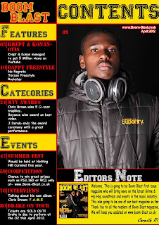
In this section I would be talking about the feedback's I received while I uploaded my music magazine on Facebook.
Front Cover
Strengths: The audience enjoyed the font I choose for my masthead. They believe that colours black and yellow really suited. They enjoyed the models as they said it doesn't look crowded or messy.
Weakness: The use of cover lines didn't make an enormous impact as I thought it would give.
Contents Page
Strengths: Most people liked the look of my contents page how its been layed out and the use of the colours scheme I used go well together. The audience also liked how it was all designed, I made sure it would be easy to follow. To keep it simple. My target audience also said that my contents page was looking the strongest than the other two. It looked very professional. Furthermore my target audience believe that my contents page looks like a hip-hop and grime magazine. This shows that I have given the right message across to my target audience.One of my target audience said: 'Everything flows together and the contrast of black, yellow and red shows quality.
Weakness: I didn't really receive any criticism for my contents page but I believed I should have added more pictures for my contents page.
Double Page Spread
Strength: My target audience like the picture I had use as they see it represent them. And the use of the name.
Weakness: The spelling O manage to make and the use of colours made it very dull. The colour's that were used weren't really supportive. My target audience believe it wasn't really suitable for a double page spread. The font I used for my quote.
Conclusion: Overall due to the comments I have received I believe that my music magazine was a successful creation. Even though am pleased with the work I have created, I believe that I could make an even better magazine as my skills has improved.


No comments:
Post a Comment